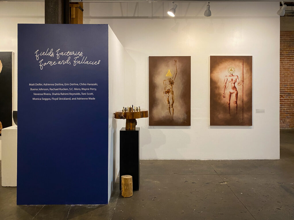
In this exhibition, the artists take a look into the forms of cultural and social reproduction interpreting these forms through materials and experiences. How does each of these categories play a role in the life cycle of humanity? Who are the characters? What are the events? What are the developments? What experiences do we pass along from each culture to advance the larger society? How has the work from the field transferred to large city factories? Where is the relationship between fame and fallacy? At what point does fame become enigmatic? What are the shared values of the art world? Of family? Of life? Marginalized under the media’s eye.
Curator:
Badir McCleary is an independent consultant. He holds an M.A. in Arts Business from Sotheby’s Institute of Art (Los Angeles/London) where he focused on emerging art markets. Having extensive contemporary art history knowledge and experience, Badir can tackle large projects with confidence, protecting and tracking deliverables and ensuring high-level success for clients. Badir was the Co-Owner and Director of Gallery 38 (Los Angeles), a project that produced exhibitions for emerging artists of color in South Los Angeles and helped contribute to several public projects globally, helping artists transform communities through visual aesthetics. (@artabovereality).
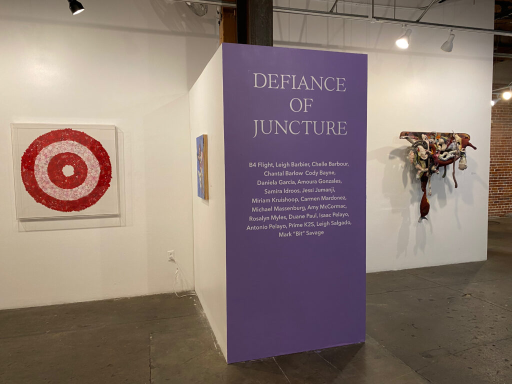
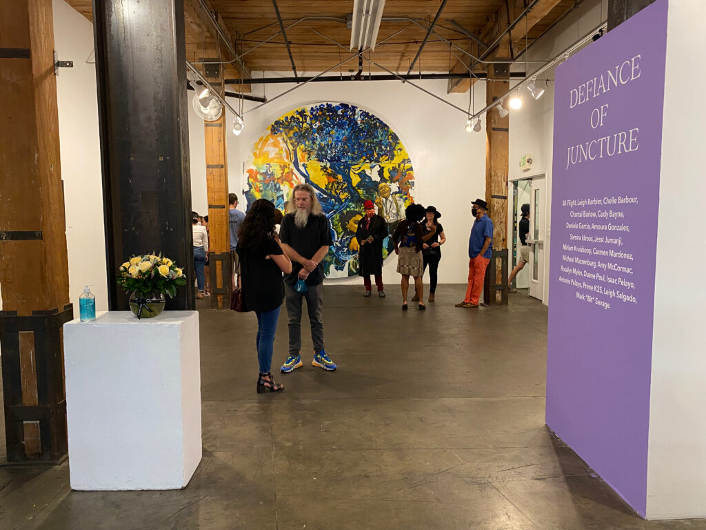
Defiance of Juncture Exhibition 2021. Curated by Badir McCleary
Defiance Of Juncture
What is defiance? Is it an action? An idea? Is it contained within a movement? An object? How does operating in that defiance define the point in time? How does defiance or the definition of defiance differ throughout time? “May You Live In Interesting Times”, the title for the 58th Venice Biennale in 2019, unknowingly predicted the sentiment of humanity just eight months later.
“Interesting Times” would prove to be an understatement, as the COVID-19 pandemic, alongside numerous uprisings in the country, gave way to the defiance of current conditions in many facets of our society. Analyzing these conditions has allowed for constant dialogue among humanity about the actions of the past and present and eventually how they will affect our future. This has given us the opportunity to create what’s to come.
Badir McCleary is an independent consultant. He holds an M.A. in Arts Business from Sotheby’s Institute of Art (Los Angeles/London) where he focused on emerging art markets. Having extensive contemporary art history knowledge and experience, Badir can tackle large projects with confidence, protecting and tracking deliverables and ensuring high-level success for clients. Badir was the Co-Owner and Director of Gallery 38 (Los Angeles), a project that produced exhibitions for emerging artists of color in South Los Angeles and helped contribute to several public projects globally, helping artists transform communities through visual aesthetics. (@artabovereality).
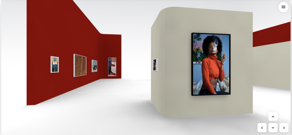
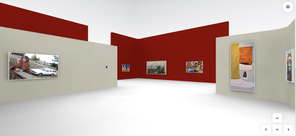
ArtAboveReality is pleased to present “Portraits of Yesteryear”, a group survey highlighting contemporary artists across multiple art practices. What do we remember about yesterday? How has it changed? What’s still as you remember it? Many people across the world have lost family members, jobs, and more which allows them to see through different eyes. These portraits are a reflection of a time we used to know – a show of humanity. Yesteryear, referring to a life-changing event is analyzed throughout these images allowing the artist a moment of reflection, and the viewer a chance to gain the artists’ perspective from their visual stories. Curated by Badir McCleary of ArtAboveReality.
Dates December 5th — January 5th
Location Online
Curators Statement
“Live the moment. Cherish the present. Anticipate the future. Frame the yesteryear” – Hlovate
Artists In The Exhibition:
Kwesi Abbensetts (@kwesiabbensetts), Amy McCormac (@mccormacamy), GreatJoy Ndlovu (@ngreatjoy1), Kemal Celnigir (@streetwiseLA), Elmer Guevara (@3lmski1), Nema Etebar (@nemaetebar), Jonah Jay (@jonah.elijah), Solomon Adufah (@solomonadufah), Erika Dickstein (@hagueNYC), J. Michael Walker (@jmichaelwalker1), Monica Seggos (@monicaseggos), Patrice Robinson (@patdowart), Neequaye Dreph (@dreph), and Andrew Navarro (@oogumvision).
Curator:
Badir McCleary is an independent consultant. He holds an M.A. in Arts Business from Sotheby’s Institute of Art (Los Angeles/London) where he focused on emerging art markets. Having extensive contemporary art history knowledge and experience, Badir can tackle large projects with confidence, protecting and tracking deliverables and ensuring high-level success for clients. Badir was the Co-Owner and Director of Gallery 38 (Los Angeles), a project that produced exhibitions for emerging artists of color in South Los Angeles and helped contribute to several public projects globally, helping artists transform communities through visual aesthetics. (@artabovereality).
The exhibit will be on view to the public on the KunstMatrix (@kunstmatrix) platform from December 5th through January 5th (Live Exhibition: https://artspaces.kunstmatrix.com/en/exhibition/2701775/portraits-of-yesteryear). Stay updated with the exhibition on social media via the hashtags #ArtAboveReality, #PortraitsOfYesteryear. Please contact info@artabovereality.com for more information. Exhibit information available upon request. All images are subject to copyright. ArtAboveReality also partners with @artmoney for all of your art collecting needs.
“Live the moment. Cherish the present. Anticipate the future. Frame the yesteryear” – Hlovate
Portraits Of Yesteryear: Artist Talk – Amy McCormac
Portraits Of Yesteryear: Artist Talk -Patrice Robinson and Monica Seggos
Portraits Of Yesteryear: Artist Talk – Erika Dickstein and Nema Etebar
Portraits Of Yesteryear: Artist Talk – Elmer Guevara and Jonah Jackson
Portraits Of Yesteryear: Artist Talk -Andrew Navarro
Portraits Of Yesteryear: Artist Talk – Neequaye Dreph Diane and Greatjoy Ndlulovu
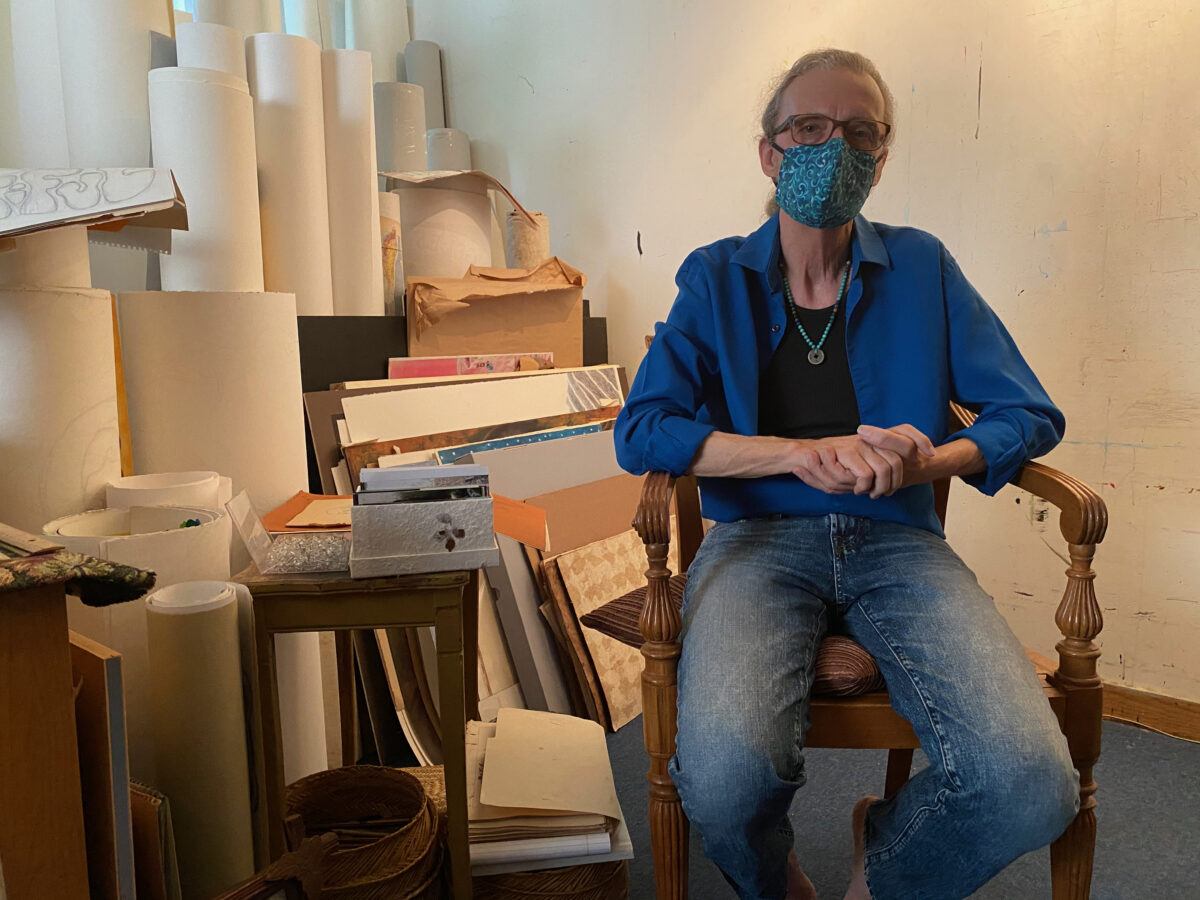
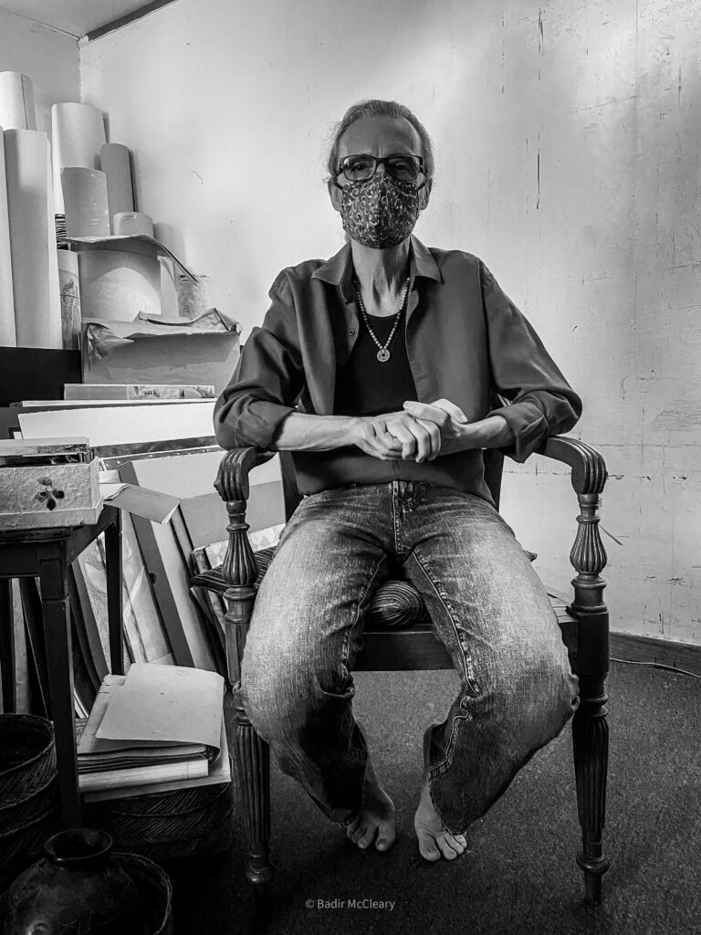
There aren’t too many artists in the City of Los Angeles that offer soothing remedies when visiting their studios. Most of the studios I’ve visited during my time immediately adopt the mind state of the artist – organized chaos. Visiting the creative space of Los Angeles-based artist J. Michael Walker (known affectionately as “J. Michael”) has a different feel, and now I understand why. Born in the American South (Little Rock, Ark), Walker has a soft audible charm allowing you to feel comfortable in his presence. His hair tied back and buttoned-up shirt with rolled-up sleeves is usually how you’ll find him, comfortable but ready to contribute. My second visit to his studio space gave a deeper insight into his practice and I found that comfortability and contribution were at the base of his creativity.
When you arrive at his space you are greeted by African sculptures of the Yoruba Orisha Exú that sit as guardians outside the studio, protecting the energy that lives inside. This immediately gave me the feeling of walking into a sacred space, as these “treasure guardians” were allowing us safe passage into the studio. You’re welcomed by a mountainous display of literature, reference material, and cultural artifacts that absorb three-quarters of the space, leaving the artist a fair amount of space to execute tasks. It always reminds me of my childhood when my mother would ask “How in the world can you find anything in all of this?”, and I’d respond “I know where everything I need is.” I’m certain it’s the same with J. Michael, as he navigates through it all to locate texts and objects to share for our visit.
On display (on the only wall absent his books) was a selection of seventeen midsize drawings, some completed while others sit in progress, offering different representations and poses of the female figure. I was intrigued by the origin of the collection as Walker explained that each began as a figure drawing exercise some twenty-five years ago. As he explains the work, there is a soft piano riff that plays on a small speaker in the studio, very timely background music for this presentation.
As he begins to move the series to another position on the wall to make room for the presentation of another work, he carefully unpins each drawing, treating each piece with special care. The work conveys a level of intimacy, a relationship of trust, and a deep dive into not just the physical, but the innate beauty of each subject and Walker handles them as so.
In one of his projects, a photo series titled “Bodies Mapping Time”, Walker lends that intimacy to the camera, injecting a mature gaze that presents the value of the spirit while using the body as a vehicle. “Bodies Mapping Time” presents dozens of women of all races at different stages of life, as they use photography for “self-empowerment, to overcome abuse and trauma, or to mark milestones in their lives”. The portraits remind me of the nude works of the renaissance with low lighting and high elegance, with Walker using natural everyday furniture, flowers, and objects to accent his subjects. “The reason that these portraits have power is that the women feel totally at ease,” Walker explains, “a comfort that allows them to be themselves and forget the fact that they’re not wearing clothes. My goal is to create an environment that makes the subject feel at ease so that their poses bring out their natural personalities.”
Walker’s figure sketches allowed me to envision Walker’s practice as more of a sculpture study, as he examines the different ways in which a body can be positioned with each pose evoking different emotions. He illustrated the process of sketching a human face that he taught to his class of 4th graders- before classes were halted by the COVID-19 pandemic. He starts by identifying the features that make up the human face and its attributes, simplifying the task, almost leading me to believe I could go home and replicate. Maybe I should sign up for the 4th-grade classes when the pandemic subsides? (Shoulder shrug).
A question came to mind as Walker began to pin a recent portrait titled, “Retrato de Matianita,” to the display wall. “Is it always a subject in mind when artists create portraits or are there times when a person is created from a collection of faces, seen and unseen?” Walker thought back to his days of drawing as a youth seeing images and being able to personalize it, “make it mine”, in his words. The personalization in portraiture is the observer’s experience and interpretation, that still shot that we all have of a person’s face when someone says their name in remembrance.
After pinning the portrait to the wall and fudging with the speaker, Walker sits down to take a breather, but not before reaching over to a box of photos sitting on a stand near more sketch drawings. He shows photos of women from Oaxaca, Mexico on a recent trip. One photo that stands out immediately is of a young woman from the Folklorico dance troupe. She is dressed in a red patterned dress, with a matching headscarf with braided colorful fabric that dangled gracefully from it. The colors of the fabric complimented the bright blue of the rosary that she wore prominently around her neck.
She commands attention by just standing there, looking directly at the camera without striking a pose, surrounded by the natural foliage of the area. The photo is a real-world interpretation of Walker’s portraiture. He feels the power in women and uses his photography, drawing, and painting as a way to honor them. He continued telling stories of the people and his experiences of Mexico as a young man taking in the culture and learning the language, ultimately meeting his beautiful wife, Mimi. He spoke of this moment with great enthusiasm as he talked about his first time experiencing a new culture, turning twenty-two when he arrived. He spoke with a smile about the “drop-dead gorgeous teenage girl” that walked in while he was preparing illustrated texts with the nun he worked with. Prompting thoughts of “I have to stay.” (Laughs).
Walker spoke of embracing the culture, taking in the customs, and trying his best to keep up with the language. He wanted to communicate about the people, about his life, and how appreciative he was for being welcomed into such a loving community, rich with history. He began doing images, immediately finding the value in depicting actual people from the town. He felt it important that he show people in a way that exalted them, a different sentiment than he experienced growing up in the South where he encountered extreme racism toward the Black and Mexican populations. We spoke about how photography from the West (usually by white men), created a derogatory narrative about Latin American countries and the world in general.
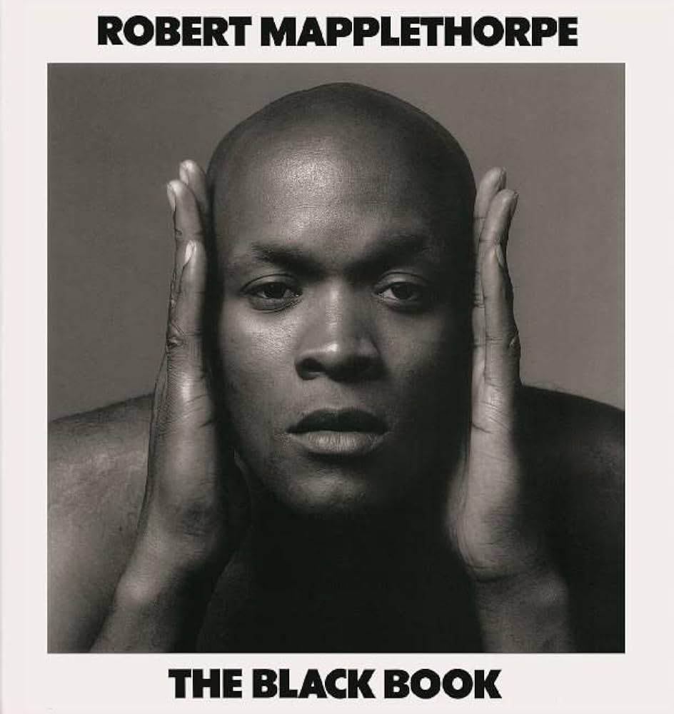
He mentioned a photography book that he once came across in Chihuahua, Mexico – his adopted second home –, and how he became offended at how belittling the photos were about the culture. He waxed poetically about creating a project to counter that narrative. Dubbing it the “Invisible Handshake”, Walker looks to “tear down the North American photographer who has gone to Latin American countries and focuses on everything that evokes danger, poverty, and folks without hope”. This immediately made me think of the photographer Robert Mapplethorpe and his work with the male gaze as he looked at the bodies of black men, provoking discussions about race, power, and media – that still haunt our society today. J. Michael is hoping to use his photography to assist that narrative in correcting itself.
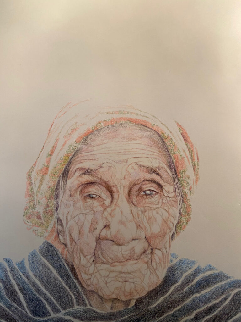
After a brief conversation on photography, we turn our attention to the “Retrato de Matianita” that’s displayed on the exhibit wall. These portraits, whether drawn or painted, are considered “Tributes” and are dedicated to the local elderly people in the municipality of Bocoyna, his wife’s homeland. Just like the elderly in our society, the show was hidden inside of the brutalist architecture of Consulate General de Mexico and now in his studio.
Hidden inside of the eyes of the subjects are decades of knowledge, experience, love, pain, and humanity. The focus is solely on the subject, not the artist as he abandons the traditional use of a background in his portraits to direct the viewers’ attention to the entirety of his subject. Walker made the choice not to include anything beyond the faces and a small fraction of clothing only to give a sense of where they’re from. By doing this, he hopes to relate the universality of his subjects. His thoughts are accelerated as he tells a story of a previous visitor comparing the likeness of the portrait to that of his Polish grandmother.
Expressions of gratitude, gratefulness, recovery, and deliverance draw you directly to the eyes of the work. Positioned low on the paper relates the size of the elderly woman with the blank space above as a reminder of where your eyes should be. This creates an intimacy with a stranger, a conversation with not the work but the eyes of a grandmother, the matriarch. He wants the viewer to feel like “they couldn’t escape the encounter with the person, just face to face.”
His use of the whitespace interprets the closeness of the subject to the earth. The use of this negative space works in unison with the pencil lines carved into the thick paper creating uncanny wrinkles, facial hair, and other detailed elements, revealing a level of life as if the likenesses were stamped directly from their person onto the paper. The colors, earth-toned with a graceful blue wrap lending elegance to the subject while simultaneously acting as a stabilizer, as you follow the carefully drawn patterns of the skin not missing a single feature.
Walker works until he feels that his subject is fully present, and then he stops. “If I keep working, then the portrait becomes more about me.” He feels the deepest responsibility to get it right with his wife as his first critic. She also has a personal connection to the work as she was the photographer who provided the referenced images in the series. He speaks with so much love and reverence about his subjects, trying to evoke the beauty and the spiritual essence of the person being memorialized.
He believes it is his gift to create loving, stellar portraits of people who have gone unheralded in life and would possibly never have had their portraits painted had he not done so. The elderly never like to be seen as weak, needing assistance, and/or a burden on society and Walker seizes the opportunity to make the ordinary, royal. He also thinks back to the photography when speaking about the people in the community saying, “I could never use the face of any of these people to say anything that would come across as disrespectful, who the hell am I?”. The portraits also act as a way for the family and community to steal back a moment of the loved ones who are no longer here, revisiting happy feelings, emotions, and memories.
Just as he’d done earlier in the visit, Walker has a seat in his chair and begins to go through another box of random photos, much larger than the one that contained the image of the Oaxacan woman. Before he started to explain what was in the box, I stopped him for a photo in the seat just to capture the moment. The resulting image ironically took on the traits of the Oaxacan woman with the commanding stare (aided by the social distancing mask) as well as the negative space above the head as we saw in the tribute series. A bit of the artist’s repertoire comes full circle, this time with himself as the subject.
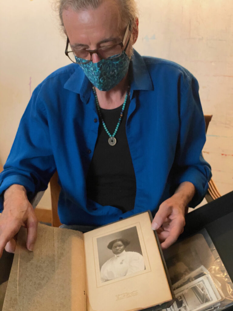
As he started to open the archival box, I noticed there are groups of photographs packed neatly with glassine sheets, carefully preserving its contents. Before thoroughly explaining what they were, Walker spoke of his 2000-2008 project titled “All the Saints of the City of the Angels”, an epic painting and text exploration of the multicultural heritage of Los Angeles via its 100+ streets named for saints. He prepared me for some of the images he found during his research, as many contained racist imagery or language that misrepresented the true nature of the people photographed. He spoke painfully about finding an early 20th-century postcard depicting a black woman breastfeeding her child, accompanied by the text “Free Lunch”, and we both gasped at the humiliation placed upon a natural maternal image.
It again brought us to the earlier conversation of misrepresentation through the photography of the West where in many cases, these photographers would make friends with and pay almost nothing to these poor children and/or their families for the impromptu shoot. Not knowing that the image could potentially be manipulated in meaning to a point where it would outrage those who participate. The images were not all negative though; Walker has collected images where the people of color depicted maintain agency, showing joy, success, and pride, showing the uplifting side of the growing city and the people that inhabit it. There was an image of a black woman preserved inside of a photo studio folder, seemingly in her mid-thirties, posing for her portrait of what seems like a graduation picture or maybe a professional career photo. We spoke about what the possibilities could be for these people and assumed where they could be today and how an image may represent a moment in time, it is never the final moment.
As I start to wrap up my time with J. Michael, I watch how he calmly and carefully places all the materials he displayed back into their rightful spaces in the studio not to disturb the energy inside the space. There is a high level of respect that he holds for the objects he collects. He felt he was culturally and spiritually reborn in Mexico and he hopes that experience is transplanted into each artwork he creates. As I walk out of the studio sanctuary, a familiar “Ashe Brother B!’” carries me out. I wave goodbye to the Orishas guarding the doorway and thank J. Michael. That feeling I described earlier heading to the studio was the same feeling Walker described when he arrived in Mexico for the first time. A sense of welcome, a familial hug.
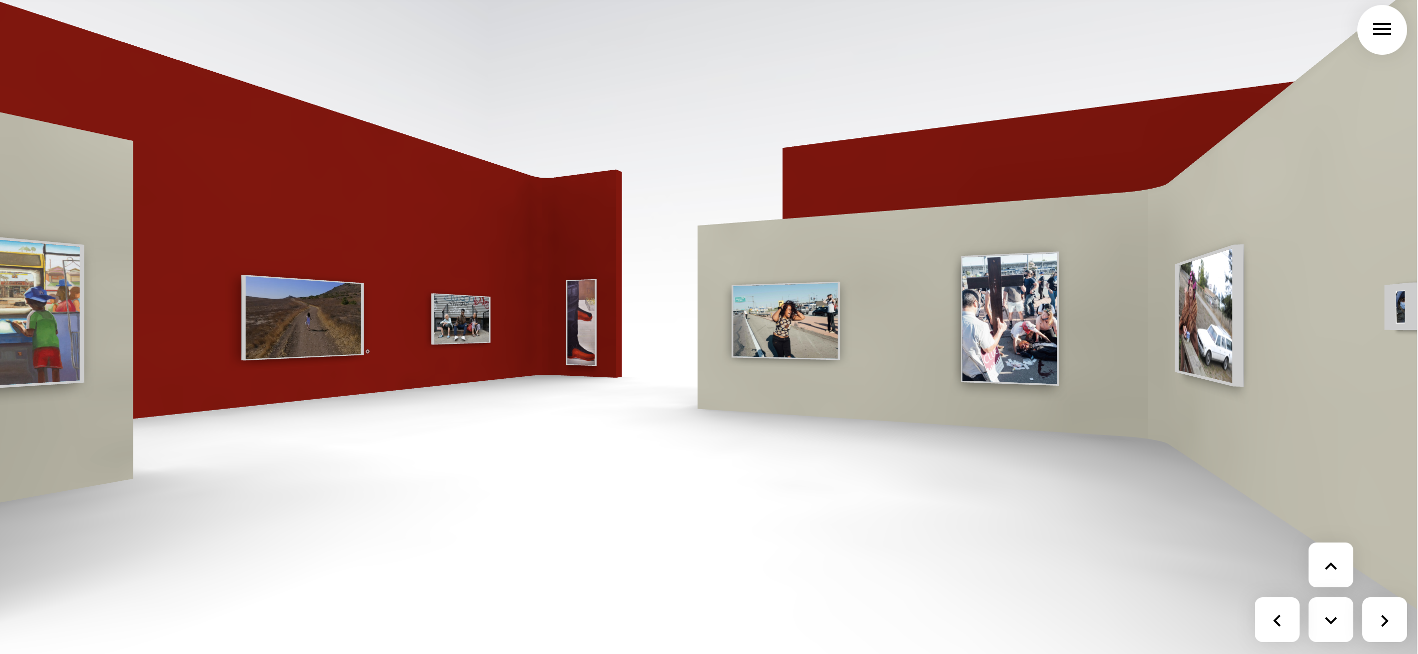
Metropolis: A Snapshot of Art Making in Los Angeles
ArtAboveReality is pleased to present “Metropolis: A Snapshot of Art Making in Los Angeles”, a group survey highlighting eighteen contemporary artists in the city of Los Angeles. What really defines a living and working artist in Los Angeles? What does an artist look like? How are artists able to manage expectations with new visibility? This exhibition takes an anthropological and sociological view on the creative practices of artists of color in the city. This re-engagement with artists and their workspaces allow the viewer a firsthand view of the creative process. This exhibition is dedicated to the loving memory of former California African American Museum Curator Vida L. Brown.
Dates Nov 16 — Dec 10, 2019
Location Bruce Lurie Gallery, Los Angeles
Exhibition Information
Artists In The Exhibition: Chelle Barbour, Sharon Barnes, April Bey, Steven Cogle, Adrienne DeVine, Charles Dickson, June Edmonds, Al-Baseer Holly, Pamela Smith-Hudson, Overton Loyd, Man One, Michael Massenburg, Norman “NOMZEE” Maxwell, Sam Pace, Duane Paul, Wayne Perry, Miles Regis, and Jamaal “Hasef” Tolbert.
Gallery:
The Bruce Lurie Gallery was established in the early 1980s in New York’s East Village. Bruce Lurie has a history of launching emerging artists into the main-stream art scene, and in his early career gave Jean-Michel Basquiat his first show as requested by Leo Castelli. The gallery has since relocated to Los Angeles’ Culver City Arts District. The gallery has a particular focus on establishing emerging to mid-career artists specializing in cutting edge street art, abstract minimalism, and pop art, with an additional recent focus on photography. The Bruce Lurie Gallery features a wide range of monumental sculptors as well.
Metropolis: A Snapshot of Art Making in Los Angeles is located at 2736 S. La Cienega Blvd., Los Angeles, CA 90048. The exhibit will be on view to the public from November 16th through December 14th. Stay updated with the exhibition on social media via the hashtags #ArtAboveReality, #MetropolisLA. Please contact info@artabovereality.com for more information. Exhibit information available upon request. All images are subject to copyright.
“No other field is closed to those who are not white and male as is the visual arts. After I decided to be an artist, the first thing I had to believe was that I, a black woman, could penetrate the art scene, and that, further, I could do so without sacrificing one iota of my blackness or my femaleness or my humanity” – Elizabeth Catlett
With the rise of attention in works by women, artists of color, and the LGBT community, museums have seemed to pivot in a new direction – prioritizing inclusiveness – in an attempt to “correct” the underrepresentation of such artists in its programming. “Soul of a Nation: Art in the Age of Black Power 1963-1983” featuring the artwork of pioneering black artists, poets, and photographers opened at The Broad Museum in Los Angeles on March 23rd, 2019. This is the exhibition’s third stop in the United States and first on the West Coast – after originating at the Tate Modern in London in 2017. The exhibition celebrates the artists and the movements they helped to institute in the two decades after 1963 when the Civil Rights movement started to gain steam.
Reminiscing through photos from my visit to its installation at the Tate Modern, I attempted to re-familiarize myself with the retrospective by trekking back through the works, re-living some of the feelings I had at first sight. As I browsed through the display, I pondered how the exhibition would be received by the city and its artistic community. How would the museum curators arrange its display inside the institution? The Broad Museum’s plush galleries and modern architectural design have a way of rejuvenating the excitement of the artwork on view. It has the uncanny ability to reintroduce work to its contemporary audiences with newness as if these works were just acquired from the artists’ studios moments before they furnished the walls. I was excited to see if this magic would lend itself to the newest exposition, allowing the artists themselves to relive the moments and actions that spawned these objects. But what in the exhibition would be “adjusted” before it made its Tinseltown debut?
It’s always thought-provoking to see what works are chosen for display and why. Fred Wilson’s Mining the Museum, 1992, at the Maryland Historical Society, brought awareness to institutional collecting and exhibiting practices that often favored the display of works by white men. Through this installation, Wilson was able to unearth works from the collection – alluding to the biases that these spaces have – presenting a case study impossible to ignore. With this in mind, I asked myself if The Broad Museum and its curatorial team would try to lean toward the promotion of more commercial works from the artists – minimizing the history of the period – to focus on drawing more attendance for local and national visitors. Speaking to The Art Newspaper, Founding Director of The Broad Joanne Heyler spoke to the process of deciding on whether to take on this exhibition and how it almost didn’t happen. “There is not an overlap between the artists in the show and the Broad’s collection,” Heyler remarked. With many of the featured artists spending a significant part of their careers in the city and surrounding areas (Betye Saar and Noah Purifoy among the most notable), the biggest question I had for the Broad acquisitions team is – Why not?
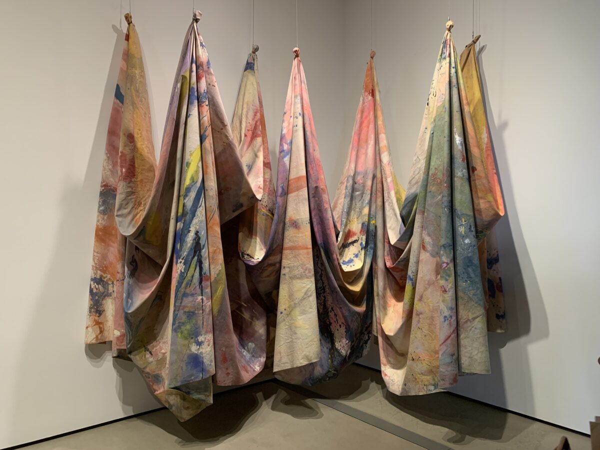
Greeting you at the entryway is Carousel Change, 1970 by Sam Gilliam, a large piece of canvas resembling bed sheets with different shades and splatters, which I can imagine lived on the floor of Gilliam’s studio initially. The way this work was displayed at the entrance made me feel a bit uneasy. The last time I saw this work at the Tate, it was presented – in what seemed to be its entirety – full and stretched across the wall accentuating its scale and the vibrancy of color it contained. It welcomed the viewer like a big hug from a grandmother. In this display it confronts me in the form of a mob of seven Ku Klux Klansmen dressed in colorful robes, immediately bringing up thoughts of the 2015 “Birth of a Nation” project by the artist Paul Rucker. I wonder if anyone else felt this way? I digress.
Accompanied by a soundtrack curated by Quincy Jones – which is available via QR code visibly accessible on the gallery walls – you’re audibly guided through the retrospective with a playlist of horn-inspired rhythms and dialogue, allowing you to experience the music that defined the time. Quincy Jones in his summary on creating the list quotes that “You gotta know where you’re coming from to get where you’re going,“ as a precursor to this curation. With hits like “Say it loud, I’m Black and I’m Proud“ by James Brown and “Young, Gifted and Black” by Nina Simone, I was interested in experiencing firsthand how the list would correlate to what visitors experienced. So I pressed play and started to head on in. Ironically, Gil Scott Heron’s “The Revolution Will Not Be Televised” was the opening song.
We are introduced first to the SPIRAL Group, a collection of artists whose work reacted to the Civil Rights Movement, questioning how – as artists – they could interpret the times. Executing works in black and white only, artists like Norman Lewis, Emma Amos, Hale Woodruff, and Romare Bearden among others, sought to challenge the question of the Negro image in visual art. Lasting a few years (1963-1965), the group mounted the only exhibition titled “First Group Showing: Works in Black and White” as a response to black artists being overlooked by the institutions. Similar to a recent epidemic in major cities across the country, rising rents in the area where they gathered cost them their meeting space which ultimately led the group to go their separate ways.
You come across powerful works such as Freedom Now, 1963 by Reginald Gammon referencing The March on Washington. Depicting a scene of activists in bunches – seemingly about to march right out of the painting into the gallery – it struck me how using only the two primary colors the artist was able to conceal the races of the subjects. This manipulated viewpoint gives evidence to the “We are all in this together” motto that is often brought up during points of civil unrest in America.
The most astounding and polarizing work to me in the SPIRAL gallery was America the Beautiful, 1960 by Norman Lewis. This abstract work at first glance appears as random swipes of white house paint on a black panel, insinuating at a figure to be revealed once the viewer steps back to catch a full view. Upon further investigation, you see the shapes in the paint start to materialize and then realize you’re looking at a representation of a Ku-Klux-Klan meeting. I love the correlation in these works together. These works represent groups of people acting out its form of support for their message, which mirrored the inception of the SPIRAL group. It also puts on full display the duality of the American reality where dueling classes continue to battle for their rightful place in society. I often see the SPIRAL Group reemerging in the work of contemporary artists like using the same color palette to deliver his vision.
As the decade progressed and the voice of “Black Power” started to define itself through defiant imagery, black artists aimed at creating an identity of activism through their work. Symbols like the raised fist – The Black Power salute – and the American Flag were used as catalysts, sparking debate about the country’s treatment of its African-American citizens. This led to the emergence of the Black Arts Movement (BAM) which like the SPIRAL Group, organized their communication through artistic practices – albeit more politically charged. The gallery presents some of the imagery in the form of newsletters, caricatures, posters, and magazines in a vitrine showcasing the outreach of the groups in different forms of media.
Immediately upon entering the gallery, you can feel the tension in the work. Hinting at the catalysts previously mentioned, works like Kay Brown’s The Devil and His Game, 1970, depicting then-President Richard Nixon playing what appears to be a game of checkers with Rev Dr. Martin Luther King Jr, using black children as the game pieces. And Dana C. Chandler’s Fred Hampton’s Door #2, 1975, a sculptural replica of the front door of Black Panther Fred Hampton that was shot through by Chicago Police – eventually entering and murdering him and another Panther member. They combined a grim history within its presentation. Mixed in with these works is Blackboard, 1967-71 by Cliff Joseph, showing a female teacher and young male student locking eyes with the viewer in front of a blackboard containing a Black History alphabet. Joseph used the subjects as signals for the need for “new revolutionary vocabulary”. The artworks in this gallery are more direct in their presentation – with the artists not pulling any punches – using the material as a channel of expression.
Benny Andrews’ Did the Bear Sit Under The Tree?, 1969, stares at you with the shaking fists of a man who has had enough with the country whose liberties he thought he’d be able to thrive under. The rolled-up nature of the flag in this work was very telling as it could describe what you would find if you look behind the curtain of America, or possibly, a fed-up citizen rolling up his flag to discard it – because its meaning doesn’t apply to him anymore. Andrews along with Cliff Joseph created the Black Emergency Cultural Coalition (BECC) in response to “Harlem on My Mind”, a 1969 exhibition at the Metropolitan Museum of Art in New York, in which all the black artists in the neighborhood’s invitations to participate mysteriously got lost in the mail. I hope you can appreciate my sarcasm.
I loved the juxtaposition of the works by Faith Ringgold (The Flag is Bleeding, 1967) and Elizabeth Catlett (Black Unity, 1968). Ringgold’s work arranges three figures behind a blood-soaked flag. All are locked in arms with the figure of a black male obscured behind the stars. What makes this stand out, even more, is that the black male in the painting holds his hand on his chest – reminiscent of the pledge of allegiance – but is also clutching a knife. I would love to know what that’s all about. Catlett’s Black Unity, 1968, is a double-sided sculpture appearing as either a clutched black fist or a duo of faces depending on where the viewer is positioned. Made from mahogany, the bronze nature of the wood accentuates the message of “Black Power” – as it is polished to read as black skin. When I doubled back and looked again, it’s almost like the black male figure in Ringgold’s work is having a dialogue with the faces of Catlett’s sculpture. It’s as if they’re sharing an intimate secret, instructing folks to stand firm but always watch your back.
I was a little disappointed to see that American People Series #20: Die, 1967 by Ringgold was replaced in The Broad Museum curation, as I really enjoyed seeing it in the Tate Modern display. Why the change? Was the loan period was over from the MoMA? Who knows?
In the black community, “The Streets“ has been a term used to represent being excluded from the mainstream, forming an underground set of values. Many black artists sought visibility outside of the white cube by taking to muralism. As an addition to the display, the curators presented “Art on the Streets”, a slideshow of archived photography of these murals across America. Focusing on The Wall of Respect – a mural on Chicago’s South Side – the murals became a place for gathering, ultimately leading to a rise in muralism across black neighborhoods. Being a Los Angeles resident, places like Leimert Park and The Great Wall of Crenshaw come to mind as references to how the wave of black muralism inspired the optical tone of our neighborhoods.
Chicago was a key location in the Black Power movement and in some cases has been dubbed “The Heart of Black America”. Producing art movements like AfriCOBRA (African Commune of Bad Relevant Artists), artists in the Midwest looked to add a new flavor and rhythm to contemporary painting. The group set out to paint positive vibrant images of black figures and penetrate the scene with an abundance of color. The works speak action into the gallery easily dominated by Wadsworth Jarrell’s depictions of Angela Davis in Revolutionary (Angela Davis), 1971 and Malcolm X in Black Prince, 1971. Both paintings burst with the images of the activists, surrounded by text that form to their features on canvas. Jarrell chose to use one of Malcolm X’s speeches at the bottom of the painting, giving power and emphasis to his words, while Davis’ image – pulled from a LIFE magazine photograph – was adequately decked out with a shoulder strap filled with wooden dowels (“bullets”), reflective of one of Jae Jarrell’s Revolutionary Suits – that was on display in the center of the room.
It was cool to also find the same admiration for Jarrell’s Revolutionary Suits in Jeff Donaldson’s Wives of Sango, 1971, which portrays three black women heavy militarized in formation, ready to take on anything that’s in their way. Donaldson presents the women as different ages, in different styles of clothing, and with different hairstyles – showing the varying appearances of the black woman – while concurrently alluding to their willingness to protect at all costs. If you’ve ever come across a black mother then you know this to be all too true. Carolyn Lawrence bursts with her colorful jazzy canvas work titled Black Children Keep Your Spirits Free, 1972, which resembles a poster from the psychedelic era, vibrant with color, and a slurred movement almost as if time is slowing down as your viewing.
As we enter “Black Light”- a gallery highlighting the work of black photographers – we come across an array of black and white works led by Roy DeCarva, showing his range in creating deep tonal photographs of life in New York City. Before seeing his work in the exhibition, I was under the impression that Gordon Parks – who is noticeably absent from the display – was the pioneer for the photographs of black life in America. I believe that while Gordon thrived in storytelling through documentary photography, Decarva set out to show blackness abstractly – focusing on the skin tone and features of the subject – creating drama through moments of calm. One of those moments came in the form of Shade Cord and Window, 1961, where a thin piece of string takes the form of a noose. Positioned close enough to where the window sill creates a bold shade of black, the string gently, quietly, and ferociously stands firm in the photo overlaying a building in the distance. This photo to me is quite moving. I believe Decarva spoke to the systematic racism in the inner city and how that ugly part of history seems to be inescapable.
Alongside the photography of Decarva, I was also introduced to the work of Beuford Smith whose 1968 photograph Man with Roses, 125 St. NYC, 1968, was another that stopped me in my tracks. Promoting black love, Smith seems to catch an older gentleman at random – possibly at a bus or train station as you noticed a woman walking with a bag in the background – waiting patiently with flowers for a loved one.
Also in the room was a vitrine featuring publications and photo books, under a curated selection of photographs by artists who worked concurrently, such as Herb Randall, Herb Robinson, Adger Cowans, Al Fennar, and Ming Smith. A nice bonus was seeing a digital copy of In Our Terribleness, 1970 by Amiri Baraka (formerly LeRoi Jones) and photographer Fundi (formerly Billy Abernathy). Fundi created the “Portraits of Life” in which Baraka responded with poetry. In his poem, Baraka explains his use of the word “Terribleness” as a way to uplift, a “new self-confident beauty”, enforcing the expression that “Black is Beautiful”. I would’ve loved to see the works of Howard Bingham in this section as well. His iconic black and white photographs of Muhammad Ali – a key Civil Rights figure – would have been in total sync with the tone of the exhibition as sports played a huge role in pushing the “Black Power” movement forward.
If there is one benefit to living in Los Angeles it’s that you get first-hand experience in Assemblage Art. From Noah Purifoy’s Outdoor Desert Art Museum to the sculpture of Betye Saar, the artists of the city have been the trailblazers of the movement, often incorporating elements of their reality to stage new experiences. Nails, steel, saxophones, and an old banjo case are just a few of the random items that you’ll encounter as you explore the oeuvre of the featured artists in the gallery. You’re welcomed immediately by Saar’s work Sambo’s Banjo, 1971-2 (On loan from California African American Museum (CAAM)) in which she uses the inside of a banjo case to stage a violent double lynching. In a plot twist, just above the victim, Saar – according to the documentation – left the tiny rifle visible for the character to free himself, ultimately placing his survival in his hands. This already sounds like a damn SAW movie. (Laughs.)
The room also features About Martin, 1975 by John Outterbridge who personally became a favorite of mine after seeing work of his at an exhibition at CAAM a while back. I again fell in love with this work as Outterbridge presents a tribute to Rev Dr. Martin Luther King Jr. in the form of a miniature closet resembling a military shadow box. A suit hangs in the space just under a picture of his widow Coretta Scott King, reminiscent of the wardrobe he wore in public. The suit sits on top of a black box with the names of the cities (Montgomery, Birmingham, Selma, Washington) where some of his most famous speeches were held.
One new work by Noah Purifoy was added to the Los Angeles display, too much excitement of the local visitors. Watts Riot, 1966, contains debris from the 1965 Watts Rebellion to which Purifoy transformed into the work. The piece looks as if you’ll be able to still smell the charred material but good luck getting anywhere close enough to verify it. When I look at Watts Riot, 1966, I can see the influence of Purifoy on today’s contemporary artists like Mark Bradford – also from South Los Angeles – who employ the same anthropological process to art-making. With the museum featuring a few works by Bradford in its main galleries upstairs, it allows the show to draw connections and create a bridge for viewers to understand the artistic lineage. Sidenote: Mark Bradford’s Deep Blue, 2018 is a must-see.
Not to be outdone are the “Game of Thrones” style metal works by Melvin Edwards (Some Bright Morning, 1963, Afro-Phoenix #2, 1963 and Mamba, 1965) from his Lynch Fragment series. Commenting on social injustice, Edwards used the rough material of welded steel to present abstract visual commentary and possibly gaining acceptance into the Night’s Watch along the way. John T. Riddle’s Bird and Diz, Spirit versus Technology series, 1972 resemble Outterbridge’s work as collected materials are housed together to form a larger message. An homage to Charlie “Bird” Parker and Dizzy Gillespie, the work contains a saxophone and trumpet – which protrude beyond its casing – in what Riddle calls a “breaking out of the boxes,” referring to the musicians’ ability to transcend with their musical innovations. I would love to see how this work talks to Jean Michel Basquiat’s Horn Players, 1983 in the same space as it also speaks to the improvisational style of artistry that the musicians shared. Definitely worth a trip upstairs to compare.
“Three Graphic Artists” dedicated to the 1971 exhibit of the same name at Los Angeles County Museum of Art (LACMA) featured Charles White, – whose solo retrospective is currently on view at the institution until June 2019 – David Hammons, and Timothy Washington – who I’ve had the honor to meet through artist friends in the city. Under the mentorship provided by White, Hammons, and Washington were able to develop techniques that would help define their work for years to come. Hammons experimented with vegetable fat while Washington developed a new form of etching onto metal, visible in his work One Nation Under God, 1970.
The highlight of the show for me was David Hammons’ The Door (Admissions Office), 1969. In this work, Hammons’ famed body print technique – also on display in the remaining works by Hammons in the gallery (Black First, America Second 1970, Three Spades 1971, and Spade (Power of The Spade), 1969) – is displayed on an old wooden door reminiscent of the interior doors in a schoolhouse. On the glass that sits in the door under the words “Admissions Office” in vinyl, you see an oil-based imprint of hands, a face and part of a body giving off the strange appearance of “Hands Up, Don’t Shoot!”, a catchphrase derived from the 2014 murder of Eric Garner.
It was easy to see the references to the young black bodies sacrificed to the inequality of the American school system. It’s always icing on the proverbial cake when you continuously encounter work whose meaning is still just as clear today as it was during its inception. The display of this work brought up thoughts of nostalgia, as I was quickly reminded of the museums opening day in 2015 where the press was welcomed by picketing teachers making their voices heard about Eli Broad’s (Philanthropist and Founder of The Broad Museum) involvement in a plan to increase private education through charter schools. I wonder if any of the curators considered this? Or if they even remember that? Hmm. Carry On.
As you’re preparing to cross into the next gallery, you are forced to face Hammons’ powerful work Injustice Case, 1971. Again employing his body print technique, Hammons sought to bring awareness to the treatment of Black Panther Party co-founder Bobby Seale during his trial – where he was bound and gagged after outbursts in the courtroom. A very harrowing image wrapped in the American flag, Hammons sought to “frame” the results of an oppressive structure, with the work appearing as an X-ray into the fabric of the American justice system.
I hate to write this, but the East Coast Abstraction gallery was my least favorite of the exhibition. I know, I know, it has powerhouses like Jack Whitten, Ed Clark, and William T. Williams but these works – while powerful on their own – just did not feel right together in this layout. These works are larger but lack the intensity of some of their smaller counterparts in the previous galleries – at least collectively. Speaking to the abstract nature of representation, these artists took to hard-edges and color staining as methods of creation, challenging the fact that blackness had to be rooted in figurative painting.
The gallery introduces its story with Jack Whitten’s Homage to Malcolm, 1970, an abstract tribute to the late Civil Rights leader Malcolm X. Executed on triangular canvas, the shape represents the pyramids of Egypt of which Malcolm visited on his pilgrimage to Mecca. With actions rooted in the Black Power Movement, Whitten took to his Afro-comb to move around the black paint in the center of the work – releasing hues of green, red and blue – and providing a ridged texture in the center.
Close by, you find Sam Gilliam’s April 4, 1969, a large stained canvas tribute to Civil Rights leader Martin Luther King Jr. marking the day of his assassination. This was one piece that presented itself to me as more of a representation of the evidence than a tribute. The dark reds and staining remind me more of the effort to save Dr. King’s life after he’d been shot. I see more of the blood-stained fabric of the first responders and friends who fought tirelessly to save his life. Maybe this is a tribute to them? Or maybe a reminder of what we lost as a community?
Trane, 1969, by William T. Williams provides the burst of color you’ve come to expect from abstraction with vibrant jagged lines that capture a multitude of colors finding their way through. Acting on the improvisation of Jazz – which he referred to as “Abstract Music” – Williams uses the hard-edged lines like a music visualizer, attempting to replicate the powerful sound from the performances of John Coltrane.
Peeking into abstract minimalism are the works by Virginia Jaramillo (Untitled, 1971), Daniel LaRue Johnson (D9 Flat 5th, 1969), and Tom Lloyd (Narokan, 1965) who was among the first to experiment with manipulating light as a form of art. It was really hard to experience the potential light show of Narokan, 1965 which was installed way too high to truly enjoy. This could’ve been done just a tad bit better in my opinion.
Before you crossover to the next gallery, you meet the egg-shaped canvas of Ed Clark with Yenom (#9), 1970. The work has a planetary feel reminiscent of gas giant Jupiter, with its landscape blurred – revealing only tidbits of the surface. It was interesting to read that this work (along with Virginia Jaramillo) was included in the racially integrated 1971 exhibition “The DeLuxe Show” in Houston, Texas. The show proved to be monumental as the artists descended on the Fifth Ward and provided the neighborhood with access to fine art and a foundation in which to look at black artists and modernism.
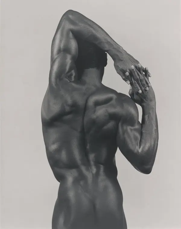
Cruising into the next gallery, you’re welcomed by the smooth and cool Barkley Hendricks who – with four large works – takes the lead in the space. The first of the Hendricks works you come across is Icon for My Man Superman (Superman Never Saved Any Black People – Bobby Seale), 1969. A portrait of the artist standing confidently against a heroic silver background, almost presenting himself as a packaged children’s toy with the “I’m all the hero you need!” moniker. With his arms crossed, he is seen sporting an afro and dark sunglasses – a tribute to the Black Panther Party leader Bobby Seale – and a Superman T-Shirt covering only up to the top of his pelvic area. Unlike his work Brilliantly Endowed (Self-Portrait), 1977, which sits across the gallery, Hendricks does a better job in this portrait of at least concealing his genitalia. (Laughs). The artist is posing naked with a white leather hat and sunglasses, wristbands, jewelry, socks, and sneakers with a very matter-of-fact demeanor. Hendricks’ exploration of his nude body stemmed from a review by the New York Times art critic Hilton Kramer – in which he referred to the artist as a “Brilliantly Endowed Painter”. Hendricks used his work (with that quote as fuel) to explore the black body as a subject while demonstrating his skill as a painter. I’ve often seen this work as a rebuttal to that of Robert Mapplethorpe and others, who were often criticized for their fascination with the black male body and the exploitation thereof.
Alice Neel presents a content Faith Ringgold seated in a bright red dress with floral print, led by dark blue strands of color that goes extremely well against the striped chair that she’s seated on. She has one hand clasping the other, as she stares directly at the viewer with a look of patience and security. Neel gives Ringgold what looks like two rosaries around her neck – possibly hinting at Ringgold’s commitment to her faith. Faith Ringgold, 1977, I believe focuses on the artist’s strength and commitment to her causes as an artist and woman, and Neel’s respect for her ambitious spirit, with the composition and position evocative of a presidential portrait.
Raymond Saunders’ portrait features the first African-American World Heavyweight Champion Jack Johnson (Jack Johnson, 1971) as an armless dark green figure in a blazer, tie, and slacks mixed in a splash of color. Inside of the vibrancy, the artist scratches the signature of the champion vertically on the right of the subject, along with a date inscribed on the bottom left, maybe hinting at the reference photo that could have been the source for the work. I think of the color splash as the noise around him as he climbed the ranks in boxing to become the champion. With his mouth being the only visible feature, Saunders places a grin on Johnson as if to imply the artist “smiling through it all” as he moves forward through his success.
Emma Amos’ portrait pays tribute to an icon in her life with Eva the Babysitter, 1973. A yellow background sets the tone for the dedication, as she presents Eva seated comfortably in a red chair – smiling as she poses for the portrait. A child enters halfway into the frame – possibly Amos’ daughter unable to sit still during the process – insisting she is included. This addition of the daughter shows the loving relationship of Eva to the mother and child. I love how Amos adds the parquet floor with the red, white, and black carpet to break up the strong yellow in the painting, allowing for the reddish hues in the clothing of Eva and the seats to have more of a presence in the work.
I can remember the first time I saw Beauford Delaney’s Portrait of James Baldwin?, 1971. After reading the description I remember saying to myself, “How is there a question about the portrait if they were known friends?”. I’ll admit that there is something a bit off about the work, but it has all of Baldwin’s characteristics – the receding hairline and turtle neck were dead giveaways – and at the time the artist was going through a few mental health issues that could’ve made his memory of his friend’s facial features a bit skewed. The mustard color palette is a sharp contrast to the more colorful portraits by the artist of Baldwin. Like his 1945 painting (Portrait of James Baldwin, 1945) in which bright reds, bold blues and interchanging shadows of brown, yellow, and white accentuate the detail in the skin, giving a more impressionistic look. Although titled by Baldwin’s brother, Baldwin himself owned this painting and I’d like to think he wouldn’t keep a random look-alike painting (laughs).
The final two Barkley Hendricks works speak to his brilliance in using solid backgrounds of a specific color, while his subjects are overlaid with fabrics that mirror the tone of the backdrop. What’s Going On, 1974, always reminded me of a Motown singing group. Four of the five subjects in the painting are dressed in all white with hats to match, and the fifth one is a woman who is shown naked with her black skin as the beautiful contrast against the bold white background. Blood (Donald Formey), 1975, is a deep blood red painting of a man dressed in plaid, toting a tambourine staring firmly at the viewer. I’ve always wondered if the primary colors of these works were representative of something. Maybe the mood or vibe the artist got from the subject? Maybe it was the dominant colors in the clothing when he started his study sketches? Perhaps that’s research for another essay.
Improvisation and experimentation have always been key to the development of new forms of art-making and storytelling. Using materials from the unified experience of the black community, the artists in this section sought to expound on their practices by introducing new ways of presentation, allowing viewers to mentally participate in understanding the message. Alongside these materials are the stories that come with their use. Melvin Edwards’ powerful work Curtain (For William and Peter), 1969 – named after artists William T. Williams and Peter Bradley who were once his studio mates – is as haunting as it is provocative.
The work, very minimalist, employs barbed wire and chains to hint at the history of American slavery and incarceration. The barbed wire strands hang down from an overhead base connected by chain links. While at the bottom, each piece of wire is intertwined with the chains – calling attention to a prison chain gang or the terrible history of slavery in which groups of slaves were chained in unison to be sold. With prison reform a hot topic in current culture, this work almost feels contemporary as these same elements and materials are taking a larger role in our society with the privatization of the prison system.
Alvin Loving’s, Untitled #32, ca. 1975, and Joe Overstreet’s We Came from There to Get Here, 1970, are prime examples of how artists experimented with the installation and display of their work. Loving cut up his painted canvases only to sew them back up again into new realities, creating colorful collaged textiles. The works are very reminiscent of quilts that have been passed down through generations in the African-American community, with new additions as time goes on. Overstreet used the rope as a way of demonstrating the horror of lynching, but also the possibility of freedom with the rope also used a supports for the work. With its tent-like appearance, the work presents itself full of energetic color with a clever undertone hinting at black artists “setting up camp” in the art world – accentuating the speculation of a “black art” aesthetic.
Alma Thomas’ Mars Dust, 1972 – one of the paintings displayed in her 1972 Whitney Museum of Art Show – shows the artist’s fascination with space. With bright red brushstrokes overtop shades of blue (that try and peak through space in between), Thomas reimagines dust storms and landscapes as she sought to stimulate her fascination with space travel. A pioneer in abstract painting and a member of the famed Washington Color School, Thomas focused on movement, patterns, and consistency in abstract painting. Her work Watusi (Hard Edge), 1963, was selected by First Lady Michelle Obama for display in the White House. For an artist who was said to be overlooked, she was constantly on view in the West Wing during the Obama presidency.
The largest work in the gallery – Frank Bowling’s Texas Louise, 1971 – gives the viewer a feeling of approaching the peak of a mountain range to look at the sunset. Vibrant ranges of color blend with stenciled outlines of the continents, referring to the global mindset of identity. As you spend time with the work you can’t help but think of Bowling’s concept of the Map Paintings and how they relate to our current world. These works according to Bowling were to “celebrate a more fluid and open idea of identity and belonging to the world”, a contemporary concept talked about but rarely practiced.
Last but not least in the gallery is Jack Whitten’s Asa’s Palace, 1973, a large purplish canvas with islands of green paint that give the impression of vines in a wisteria tree. Using what Whitten called a “developer”, he created “rake-like” strokes, with the results imitating pulling the canvas fresh from a printer jam.
Entering the gallery dedicated to the work of Los Angeles-based artist Betye Saar is like stumbling into a secret antique store in rural Louisiana. The works are very ritualistic, with sculptures resembling altars and artifacts of ceremony that Saar uses almost as remedies, mentally inoculating the viewer through the context of each assembled object. Welcoming you into the gallery are Mti, 1973, and Spirit Catcher, 1977, two totem sculpted works with a myriad of materials. These two works are seminal as Mti, 1973, was featured in her first survey show “BETYE SAAR 1964-1973” at the Fine Arts Gallery at The California State University in Los Angeles and Spirit Catcher, 1977, is the result of a research trip to Haiti – in which she studied religious belief systems and practices. I have always been amazed at the practice of Betye Saar as it speaks not only her artistic imagination but the depth in her research as there is something new to find in every repeated encounter.
Above your head are Rainbow Mojo, 1972, and Eye, 1972, work made from cut and stitched leather topped with acrylic paint to mirror their respective subjects, hanging by clear string banner-like from the gallery ceiling. Nine Mojo Secrets, 1971 and Ten Mojo Secrets, 1972, face each other in the gallery, and to understand them both, I had to do my own research and it was very informative. I found out that a “mojo” is a charm that is lauded for its purported magic and ability to heal. It was also revealed that Saar’s zodiac sign is Leo, which explains the toy lion – a symbolic reflection of herself – in the work. The lion makes another appearance in Eshu (The Trickster), 1971, this time as a portrait made out of wood, leather, straw, and feathers. I like to think this work is the artist recognizing the strength associated with her zodiac sign. Bold and full of pride and power, the lion takes the form of an African mask or a stele made from contemporary materials.
As you head up toward the finish line of the exhibition, you start to see light at the end of the proverbial tunnel. The exhibit starts to say its farewell as you can hear the crowd gathered in the lobby, awaiting their pilgrimage through the sea of visual black history. The final gallery is dedicated to the work and legacy of Just Above Midtown, – better known as “JAM”- a gallery program created by Linda Goode Bryant, focusing on exhibiting the work of African American artists. Situated in the heart of New York’s commercial art world, Bryant created a marketplace for the work of artists of color to be “seen and work to be sold”, becoming a center of black art exhibition, and a space for avant-garde ambition.
In the vitrine placed at the center of the gallery were Items from the JAM archive, including installation photographs, exhibition posters, catalogs, and publications as well as performance documentation that captured the essence of the gallery’s programming throughout its duration. It is amazing to see the amount of pride and also growth that the space produced during its history, lasting from 1974–1986.
The artists featured in the gallery were instrumental to the rise and success of JAM. By creating work that allowed for discussion, immediately provided insight into an artist’s vision. Artists such as David Hammons and Senga Nengudi used activation as a form of interaction, creating works that were lauded and also heavily debated. JAM was able to use interaction as its calling card, staging large-scale projects inclusive of the community like Lorraine O’Grady Art Is…, 1983 at the 1983 Harlem African American Day Parade.
Her forty-part photography series featured selected portraits of Harlem residents along with local storefronts and building facades that represented the fabric of the community. As the story goes, Grady entered a float in the parade which displayed a large gold picture frame. She also hired fifteen dancers to survey and interact with the parade crowds with smaller gold frames, extending the experience. In essence, to be inclusive, Grady used the public performance as an opportunity to finally “include” black people in contemporary art as many of the onlookers and participants jumped at the chance to take part.
Senga Nengudi creates works based on performance using nylon tights among other objects such as sand and rubber. I laugh when I think of my first encounter with her work in London. I initially felt cheated as if someone was playing a trick on me. For me, that was the final straw in this new contemporary art scene. “Tights with sand? How fucking desperate are we?” I thought, not knowing how uneducated I was to the power the artist had in her performance. It wasn’t until I came across the Tate Modern’s video series “TateShots” and viewed an interview with Linda Goode Bryant and Senga Nengudi did I truly comprehend the level of artistic genius she exhibited.
Her work Internal II, 1977, 2015, reminds me of a spider’s web providing support to the walls of the gallery. As I learned more about the work, I understood that it spoke to the strength of the female body and it then it made sense. Senga mentions in the “TateShots” video how the nylon is at “wit’s end” from being stretched to the point of anxiety. I immediately felt a connection to the work and how it represented my mother, a strong single woman who stretched everything she had as far as she could to see me and my brother succeed. Even if it meant she would herself be stressed and challenged beyond her greatest capabilities. As Nengudi relates it to black females, she comments on the female body being reflected abstractly as being “used” and I contemplated the way we view women and beauty standards in society. I started to think of the women who struggle to return to their normalcy after childbirth and how tough that can be. I believe this was a great way to deliver the message as you could see the strength in the fragility, a perfect reference to the female body.
David Hammons’ Bag Lady in Flight, 1975, reconstructed in 1990, leads off the display of his works shown in previous exhibits at JAM. I swear when I look at this work I hear Erykah Badu’s song, “Bag Lady”. Made from shopping bags, grease, and human hair, Hammons looks to these materials and the results of the incorporation as a dedication to the positivity they hold in the black community. I see this work as a tribute to the spending power of the black woman. With the hair and grease being primary materials in the work, I think of companies like Bronner Brothers and how they have built a billion-dollar industry with hair care products all through the spending of black women. Funny enough being from Philadelphia, a brown greasy bag has always made me smile because inside of that bag usually awaited a cheesesteak which could explain my immense hunger after the exhibition. (laughs)
Also included was Untitled, c.1980’s, a wall sculpture made from pork ribs, tire inner tubes, and costume jewelry that I still can’t grasp the meaning of. I’d like to think it represented part of his upbringing and the materials and objects that were part of his everyday life. Just as in Bag Lady In Flight, 1975, Hammons uses the items to spark a form of nostalgia, tying seemingly different items together. Maybe this was a dedication to summer cookouts and neighborhood bike riding?
One of the absolute coolest works in the exhibition is Dawoud Bey’s A Boy in front of the Loews 125th Street Movie Theater, 1976, printed by 1979, showing an adolescent boy decked out in the latest fashionable tracksuit, a stylin’ pair of shades, holding what appears to be a juice carton posing on a wooden barricade in front of the theatre. The most notable thing in the photos to me was the kid’s bright white sneakers, as the beautiful contrast in the photo makes them seem to glow. This effect is also replicated in A Woman at 7th Avenue & 138th Street 1976/7, printed by 1979, where the subject’s shoes and purse reveal a similar radiance.
Howardena Pindell’s Untitled, 1978, and Randy Williams’s, Color in Art, 1976, round out the gallery displaying new abstract assemblage practices within. In Pindell’s Untitled, 1978, she uses hole-punched dots to create a texture similar to braille on top of a re-sewn canvas. The work merges the senses as each looks deeper it seems as if you can feel the texture across your fingertips. Prompting you to reach out only to be reminded to “please stay a foot behind the line” by the gallery attendant. In Color in Art, 1976, Williams uses wooden window shutters as the structure for the work accompanied by rope and a book screwed down to the wooden frame with a plexiglass plate. Williams’ work deals with the parallel themes of inclusion/exclusion, a topic he feels still needs some addressing as he continues to develop his practice while working as a college professor.
As I exited the final gallery, I ran into Self, 1978, by Martin Puryear (Puryear will represent the U.S. in the 2019 Venice Biennale) which I must’ve completely missed walking up to the exhibit entrance. In the Tate Modern curation of the show, the work was featured in the Improvisation and Experimentation gallery but somehow made its way outside the exhibition in LA. Possibly to highlight his Biennale accomplishments which I certainly am not mad at. The work is made of cedar and mahogany stained black, sticking upwards off the plinth resembling the fin of a shark on the hunt. The work as the artist explains is a representation of self as a secret entity that appears heavy and strong but in all actuality is quite hollow. If that ain’t a jab at humanity I dunno what is. But Puryear is careful in his interpretations often leaving it up to the viewer. He stated, “I value the referential quality of art, the fact that a work can allude to things or states of being without in any way representing them.”, creating his form of symbolism as a vehicle for characterization.
So what’s is the next step after Soul of a Nation? Is this the beginning of the retrospective for black art movements? Soul of a Nation: Art in the Age of Black Power 1963-1983 was a great insight into the artistic movements that existed during the Black Power era and serves as a visual history. Are era-based retrospectives the best way to understand the African-American contribution to the global art world? As I write this essay I think of what I’ve learned just by observation. The research of artworks allowed me to understand the artists’ backgrounds, their materials, and how their use of them helped to change and develop the practice of art-making. It uncovered artistic movements that mirror those of contemporary art today, adding credence to the “history always repeats itself” saying. It also was a strong reminder as we look in that same mirror, that many of the reasons for collectives like the Spiral Group and Just Above Midtown still exist today, with black artists and professionals combating issues of inclusion in museums and blue-chip galleries in new ways.
This retrospective has activated the city with showings of black artists, as local galleries and museums are presenting complementary shows adding appreciation to the contributions of black artists to the fine art canon. I wonder how or if this exhibition will improve the primary and secondary markets of the participating artists? Will artists like Betye Saar, Jae Jarrell, and Alma Thomas start to enjoy the same market success as Njideka Akunyili Crosby now that this show has made its mark? How long will these works remain with their current collectors? It will be very interesting to see what the future holds for the careers of these artists, but for now, we can all enjoy and bask at the moment for however long it lasts.
Soul of A Nation: Art in the Age of Black Power 1963-1983 is on view at The Broad Museum, 221 S. Grand Avenue, Los Angeles, CA 90012. Through Sep. 1st, 2019, https://www.thebroad.org.
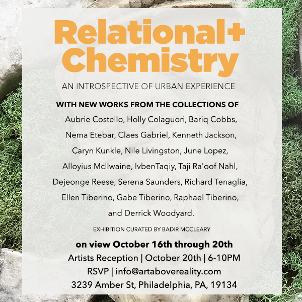
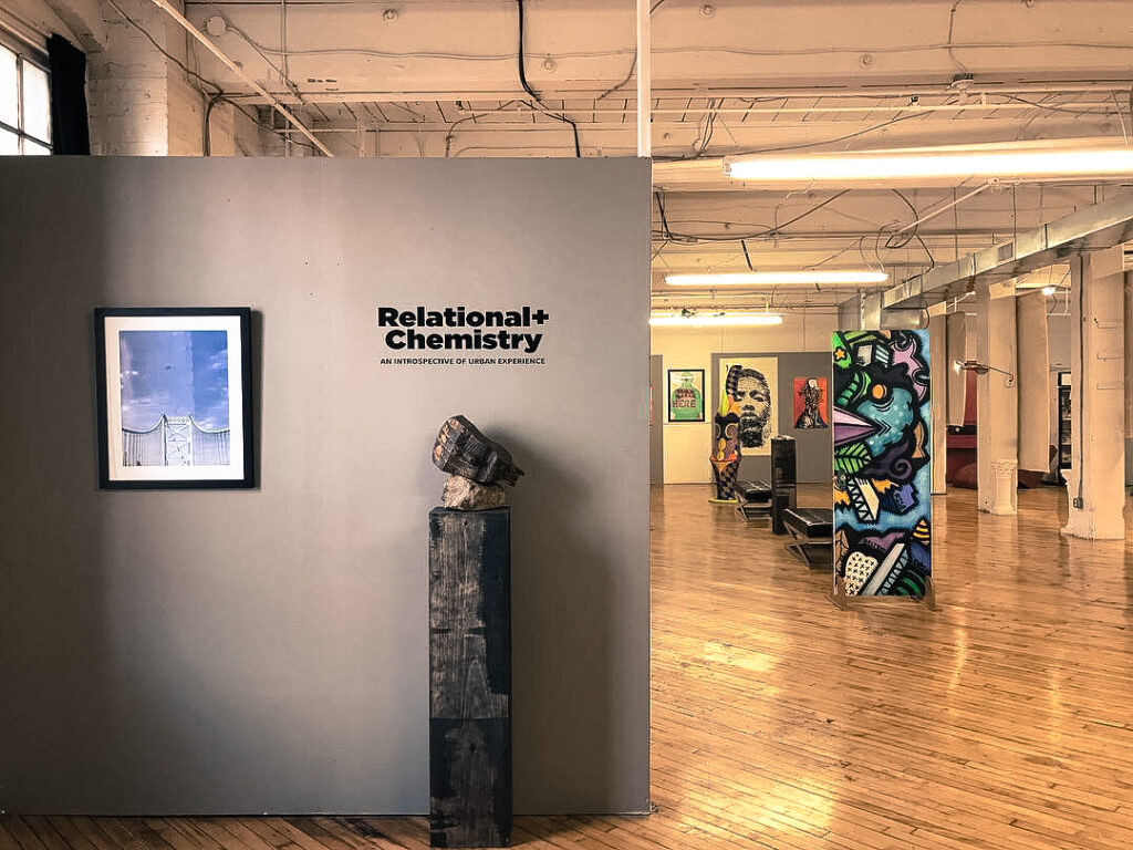
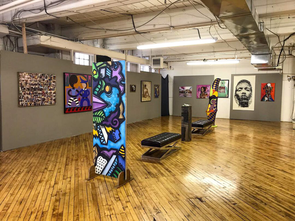
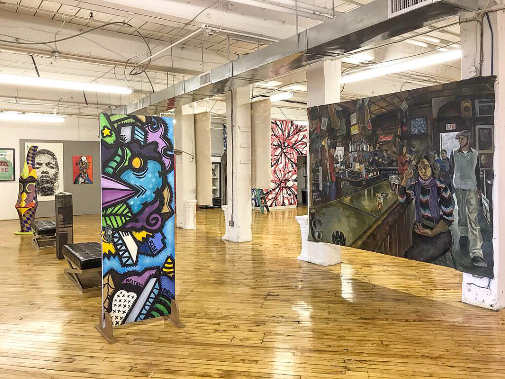
ArtAboveReality is pleased to present “Relational Chemistry: An Introspective of Urban Experience”, a group survey highlighting nineteen contemporary artists in the city of Philadelphia. Focusing on their grassroots origins, “Relational History: A Introspective of Urban Experience” speaks to the artists using their practice to realize and then share their identities, an entrance, for the viewer, into the artist’s inner selves.
Dates Oct 16th — 20th, 2018
Location Ivben Studios, Philadelphia, PA
Curators Statement
With urbanism being diverse and lively, advancing in technology, and shifting capital investment, It is shaped by power and wealth, as well as imagination and labor layered with intertwined cultural and social histories. The work manifests itself in facets of painting, sculpture, and interactive installations, centering on the interpretation of culture, society, identity, and the complex but meaningful conversations relating to contemporary issues of urbanism and human chemistry. While the members of this show come from diverse backgrounds, it is this chemistry that ties their experiences and practices together.
Artists In The Exhibition: Aubrie Costello, Holly Colaguori, Bariq Cobbs, Nema Etebar, Claes Gabriel, Kenneth Jackson, Caryn Kunkle, Nile Livingston, June Lopez, Alloyius McIlwaine, IvbenTaqiy, Taji Ra’oof Nahl, Dejeonge Reese, Serena Saunders, Richard Tenaglia, Ellen Tiberino, Gabe Tiberino, Raphael Tiberino, and Derrick Woodyard.
The exhibit will be on view to the public from October 16th through 20th. Press release and show imagery available upon request. Please contact info@artabovereality.com for more information. “Relational Chemistry: An Introspective of Urban Experience” is located at 3239 Amber Street., Philadelphia, PA 19134. Stay updated with ArtAboveReality on Instagram (@ArtAboveReality) via the hashtags #ArtAboveReality, #RelationalChemistry. Also, visit us at https://artabovereality.com. All images are subject to copyright. Gallery approval must be granted prior to reproduction.
Black Bodies, Feminism, and Representation. Is the use of the body in art the most effective way to examine social inequities and help to progress the surrounding conversation?
The body being one of if not the most sacred pieces of humanity, is also often one of the most scrutinized, abused, and controlled entities of our society. It has been used to judge, influence, and portray humanity, creating a classification system in which certain validations are required for participation. The body, and its representations, have also been used to spark debate, incite protest, and warrant further study into its meaning to science, politics, and art. The body has been used to make political statements against censorship and control and promote beauty in the human form. This duality sometimes gives way to endless debates about the body’s representation in society.
Artists have long been truth-tellers of society through the masterpieces that they create, sometimes the messages are hidden beneath the surface, and other times so direct that it has been known to resonate immediately with its viewer. A great artist or artwork is one whose message continues throughout time as a capsule of the current moment. Like the body, this capsule contains stories of the past and allows for future examination and debate.
I will examine three artists and their works that I believe help demonstrate a societal outlook on the body. Barbara Kruger, David Hammons, and Robert Mapplethorpe are all prominent in their fields of study with interesting works that deal directly with the human body. Critical, Controversial, and Timely, these artists demonstrated the use of the body as a medium, as a representation of judgment, and to fight against laws that were set to determine who was in control of its essence. The question I have is whether or not the use of the body in art is the most effective way to examine social inequities and help progress the surrounding conversation.
Specifically, three prominent works by these artists come to mind when I think of the representation of the body in art. David Hammons’ America the Beautiful, 1968, Barbara Kruger’s Untitled (Your Body Is a Battleground), 1989, and Robert Mapplethorpe’s The Black Book (1986), are three works that will live forever because of the connections to the representation of the body in different forms in their current moment.
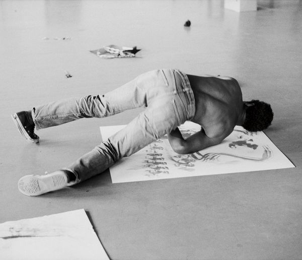
Historically, through slavery, Jim Crow laws of the American South, and the Civil War, black bodies have been an instrument in the development of America. In 1968, when the civil rights movement drew to a close, these same bodies were still seen as inferior and a target to American society by the government, media, and corporate community. Inspired by the body movements of Yves Klein’s Anthropometriesandusing his body as the tool for creation, Hammons created this piece by covering himself, torso, limbs, and face in oil and margarine, then pressing himself against the paper in almost a reenactment of black bodies being slammed on police cars. Showing the smashed impressions of his physical form, Hammons can evoke the impact and change on the body structure as it hits the surface revealing only certain features in the form of a manual x-ray or a thumbprint.
David Hammons: Body Prints, 1968-1979
David Hammons: Body Prints, 1968-1979
David Hammons: Body Prints, 1968-1979
Hammons used this method of production in an assembly line fashion hinting at the continuous strain on the body as in fieldwork for slaves. Adding the American Flag as a key part of this piece goes to symbolize these horrors wrapped up or covered up within the American Constitution. Creating lithographs of these prints I believe hinted at the countless bodies being used in the horror with the reproductive process being used as a metaphor for American production.
In using critical race theory in this work Hammons identifies himself with the examination of society through race, law-making, and the elite class. Hammons challenges the notion of the rejection of “color-blindness” with himself as the tool insisting that the viewer recognize that his own body was the sacrifice for the creation of this work. Hammons demands society to engage with this work through the eyes of privilege and discrimination which continue the overarching hand of supremacy in America. Using this work as almost a parable for the black experience in America, Hammons attempts to preserve the history of black pain in the period by documenting its effects on the mind, body, and character of its marginalized citizens.
Hammons’s use of this patriotic symbol juxtaposed with the black body (or representation thereof) to emphasize the racial tensions in the United States during this period. Titling the series, Black First, American Second, the artist demonstrates the discrimination that Black Americans felt from their white counterparts on issues of justice and equality. The body pressed fully against the paper also gives the viewer the feeling of a fallen war hero laid in his casket at a funeral, I believe making a sympathetic gesture of black people’s contribution to the country. With the Vietnam War still at its height, the assassination of Martin Luther King, Jr, and the start of the Black Power Movement, America the Beautiful, 1968, and its production processacts as a dedication and sacrifice of the black body.
America the Beautiful, 1968 is a stark reminder of the Dred Scott decision of 1857 that spoke to the validity of citizenship of black people in the United States. By applying the flag as a reference Hammons brings into play the inconsistency of the American government in providing liberties to its black citizens. Using Derrick Bell’s research on critical race theory as a premise, I believe Hammons used art to communicate issues of the community that previously fell on deaf ears. By imploring these thoughts in his work, he (Hammons) invites the viewer to examine the interpretations of American history and how it’s consistently played out unfavorably in the American justice system.
I would consider this piece as a component of ethnic studies for its content and contention with the Eurocentric perspective. Ethnic studies were conceived in the civil rights era when Hammons started these works and sought to change the way the stories and representations of African Americans are viewed. Hammons, I believe, felt the best way to accomplish this reformation was to show the body and its features as an accelerated instrument of explanation.
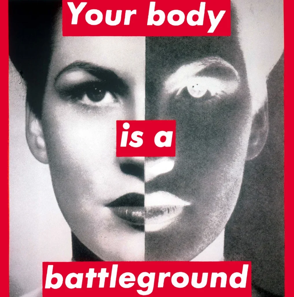
Untitled, (Your Body is a Battleground), 1989 by Barbara Kruger
Artwork of Barbara Kruger
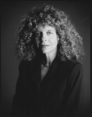
Portrait of Barbara Kruger
Body Politics, referring to practices in which society tries to regulate control of the body, has been the cause of national debate on many issues, and the Black First, American Second, series speaks directly to that theory. Hammons takes ownership of his body to deliver a message that challenges governmental procedures. He uses his body to source knowledge production and extracts a conversation about how black males are viewed by the current society which allowed him to stage an artistic protest instead of a physical one.
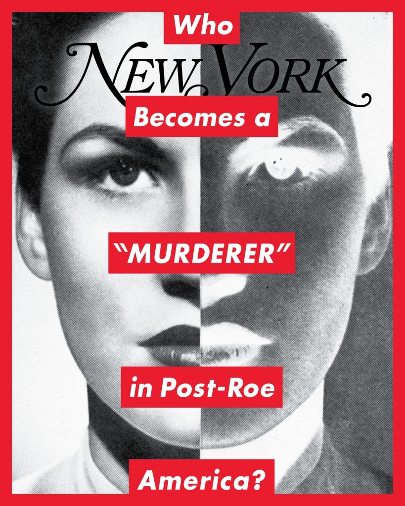
Barbara Kruger uses her work Untitled (Your body is a battleground), 1989 as a catalyst to the debate on women’s rights in the ’80s and was produced to coincide with the Women’s March on Washington. There was a rising number of demonstrations and protests in the ’80s because of new anti-abortion laws that were going directly against the verdict of the Roe V. Wade Supreme Court Decision of 1973. Kruger’s work aligns the protests with the theory of Body Politics and control over the human body.
This work with its large canvas and bold imagery almost yells at the viewer to take charge of their body. It presents the face of a woman divided into two with the negative split evenly down the middle almost presenting (again as referenced in Hammons’s work) an x-ray of the face. The duality seems to represent the people on both sides of the debate about women’s rights and who gets to decide.
The bold words of “Your Body Is A Battleground” speak to how the war has changed from “As seen on TV” to within the female body. With the bold red and white Barbara invites the viewer to stop immediately and heed the words almost reminiscent of the war posters of the late 1940s and ’50s, when they placed bold directives such as “Join The Army!” with a strong figure to entice other potential citizens who were still undecided. By using art in the style of tabloid marketing and advertising, Kruger was able to address media politics in a voice that was familiar and effective.
In this work, the body is used as a metaphor and a representation of a movement against the law. Kruger addresses the female population with action, encouraging them to seek knowledge and awareness of the current situation that affects them all. This call to action addresses a mental as well as a physical protest enabling the change in the habits of women in society as it pertains to how they view their bodies and the rights and responsibilities in making choices. Like Hammons, the work subtly calls for a mental overhaul of the social norm with the body being the catalyst for the widespread debate.
Portrait of Robert Mapplethorpe
Image from “The Black Book” by Robert Mapplethorpe
Cover from “The Black Book” by Robert Mapplethorpe
Within the body politics structure, female bodies are seen to be vulnerable and not able to be “warrior-like” which Kruger challenges in this artwork. Adding what is seen to be a beautiful woman appropriated from a magazine, she also points to the view of women as objects in society and hints at feminist views of the male gaze. These gender politics have determined who should be vulnerable and who commands respect. The male gaze in society has been seen as a patriarchal control over the body of a woman and Kruger uses the beauty of the female face to get the male viewer’s attention to the ultimate message. The female face in this work is seen as strong, confident, and direct, much different than what the societal norms are for women who were to be seen as docile and submitting to their male counterparts. Kruger uses the knowledge of “Second Wave” body politics to encourage women to fight against the politics that governed their bodies. By stimulating the consciousness of women and enacting a “no fear” visual element, it helped to break the long silence of women as it regards their bodies.
Kruger presents a two-part view through this work inciting action from women during the period. Using strong images (strong confident females) alongside very direct and bold text with tons of emotion, Kruger hoped to provoke a new conversation about gender politics. According to feminist theory, the male and female bodies differ in the sense that women are more “natural” than men, more corporeal, and therefore see a difference in their minds. In the sense of the corporeal, Kruger and Hammons relate within society as the black body and the female body have been underappreciated for their contributions to the growth of humanity and portrayed as “soulless” and in turn use their art as a way of combating this perceived difference among the colonizing class.
The male gaze and the presentation of the black body are also prevalent in the work of Robert Mapplethorpe which brings together the concepts of racial and gender politics of the body from the perspective of the white male in society. This gaze cites the “patriarchal power” of Mapplethorpe allowing him to assume his male role as the “looker” while the black male is relegated to the items to be perused at leisure. The Black Book, a collection of “idealized and homoerotic” nude photographs of naked black gay men, was looked upon as a very touchy project by Mapplethorpe. Embarrassed and outraged by its contents, many artists, theorists, and writers chose to put pen to paper to debate the relevance of this topic how it affected black men, and the artistic integrity of the works.
Mapplethorpe’s representations of the black men in this book set the male gaze in its eye, with Mapplethorpe being a gay man himself, also in charge of the very device used to scrutinize (the camera), he was able to portray an alternate reality of the black body to the viewer, his reality.
Historian Kobena Mercer places this gaze in the proper perspective as he infers that the photos are a “cultural artifact in the ways that white people “look” at black people and how in this way of
looking, black male sexuality is perceived as something different, excessive, Other.” In the period when these photos were taken the gay male body was being attacked and criticized, he chose to use others as a cause for examination, ultimately separating his identity from that of the subjects.
Mapplethorpe’s expose of The Black Book allowed the critics a duality of opinions about the work. On the one hand, the work completely stereotyped the black male body as a sexualized image, used only for desire or work, and on the other documented the gracefulness, power, and strength on display. Taking a queue from earlier sculptures such as Michelangelo’s marble David, Mapplethorpe tries to push forward a conversation of maleness and blackness using the consistency of the nude through art that has gone to objectify and sometimes enhance the sexuality of a subject in history.
Mapplethorpe prominently puts on display to the viewer through his “vision” that the greatest reward of the black male is his sexual prowess. Images such as Man in a Polyester Suit, which features prominently the penis of a black man and nothing else, are the only identifier of it being male or black in the photo leading the viewer to immediately look at its subject as an object. This places the black male body as an attraction giving the viewer an erotic source of pleasure without the permission of the model but with the permission of the photographer. A quote from art critic Holland Cotter describes this succinctly as “No face, no name, no person, just an anatomical fragment that translates into race = sex.”
This “ownership” of the body (or digital representation thereof) is reminiscent of the early days of the slave trade when black bodies were placed on display in public and news memos for sale. The Black Book has been said to reveal more about the pleasure-seeking of Mapplethorpe than it does to accentuate the abstract beauty of the “anonymous black men whose beautiful bodies we see depicted.”
Mapplethorpe uses this book of works also as a question of gender politics in the Western art world by substituting the nude of the white female for the braun of the black male body. With Mapplethorpe being a gay man, he looked to question a male’s role in society as dominant or overarching, and replacing that with a more harmonious visual helps to soften the public’s view on black masculinity but at the expense of being critically judged due to the nature of its content. Using the philosophy of otherness, Mapplethorpe exhibits his subjects as different from their “political philosophy” and in their “non-conformity” to social norms where the black body is seen as the antithesis of American society.
But how do these works change the way bodies are viewed in society? I believe the consistency of action and boldness in the presentation and the messages are what tie these works together. Mapplethorpe’s works and the distorted or misrepresented meaning prompted artist Glenn Ligon to create a contention or retraction titled Notes on the Margin of The Black Book, 1991-93, which sought to “sort out the effect these images of black masculinity had on him as well as on others”.
Barbara Kruger leads a revolution of text-based works that inspire street clothing brands and more and her message and design style have been the calling card to many works of protest. Hammons continues his message of black empowerment using common items to push the conversation and understanding of the black experience in America. They also touch on the key topics mentioned in this text referring to gender, race, and the theory of Otherness. These bodies, female, black, and gay were seen as abhorrent as racism itself, and through these works and practices of art, these artists were able to present new meanings, representations, and control over the body’s identity.
The importance of these works lies in their place and time in history and the context in which they were created. Rooting themselves in protest, activist, and resistance style practices, these works sought to change the perception of the black, female, and gay bodies and by using the body as the main component of the political study, these works helped to inspire their peers and all affected by their respective struggles. Hammons aspired to show the strain, strength, and resilience of the black body and its relation to the ongoing civil rights struggles in 1968, Barbara Kruger aimed to take back ownership of the female body and oppose laws set in place to control choice at the Women’s March in 1989 and Mapplethorpe’s work caused an uproar on both sides leading to a demonstration in which his photos were displayed on the building in protest. These body politics helped to dismantle the oppressive laws and impact of the ruling class on those bodies they deemed “inferior” by expelling the essence contained within.
The body remains a hot topic in art with some of these same topics at the forefront. From Marina Abramovic’s Rhythm 0, 1974 to Dana Schutz’s Open Casket, 2016, the use and presentation of the body and its status in society are constantly being challenged. These challenges are always a catalyst for global change and improvement without the physical war and loss that usually come with it. The body is the most consistent thing across humanity and I believe it is the easiest topic to engage humanity and allow them to look into themselves for the correct answer. These artists are prime examples of protesting, activating, and demonstrating while still attempting to educate their audience on issues and their practice will continue to influence artists to follow in their footsteps. These conversations through art justify the practice as a contributing factor to the development and its importance as a voice for the sometimes voiceless.
Artist Mike Mozart at Art Week Miami. Photo by Badir McCleary
Street Artist “MiMo” claims to be the creative force behind the ALEC Monopoly art machine
Do you believe in ghosts? I’m talking about the folks in our culture who “collaborate” in creating some of the largest art and entertainment brands known in the world today. On the heels of the Meek Mill and Drake ghostwriting feud, I was introduced to another quarrel, this time in the contemporary art world, between well-known street artist ALEC Monopoly and lesser-known (to me at least) illustrator Mike Mozart.
While interviewing both parties and hearing convincing arguments from both sides, I noticed a couple of keywords that seemed to come up very often and wanted to distinguish the difference between them. These words are “Collaborate” and “Work For Hire”. Collaborate, is defined as “working jointly on an activity, especially to produce or create something” and Work for Hire is explained as “work created on behalf of a client where all parties agree in writing to the Work For Hire designation”. Keep these two words in mind as you read this story.
ALEC Monopoly has created one of the most globally recognizable art brands today. By incorporating his personality with the face of “Mr. Monopoly”, a character created by Dan Fox and made famous by the “Parker Brothers” brand, ALEC has managed to tackle current events and convey messages through paint that has collectors salivating about owning a piece of his work. As a “Celebrity Artist”, ALEC polarizes his fans with his persona of opulent living, countless high-profile clients, and his signature top hat and facemask concealing his identity.
Mike Mozart, An illustrator for over 30 years, specializes in creating some of the most recognizable kid characters for many corporations. Has been published in over 100 kids’ books and was also one of the first live YouTube broadcasters from “Occupy Wall Street” rallies in New York City. Mike gained prominence through his Jeepers Media brand and his channel titled “TheToyChannel”, but not too many folks (at least those I have spoken with) have ever heard of the artist “MiMo” which is Mike’s moniker as a graffiti/street artist.
I felt this would be a great opportunity for Alec and me, I like the kid. I help out lots of people”, Mozart explains. To hear Mike’s story is to hear a tale of deception by an artist and friend he looked to help and support. “I felt this would be a great opportunity for Alec and me, I like the kid. I help out lots of people”, Mozart explains. But, to hear ALEC’s side of the story, it was all business. “Mike Mozart was never a “mentor” or “collaborator” as he claims, but merely a Freelance Illustrator who created works for hire and was compensated for these services,” says Avery Andon (ALEC Monopoly’s manager).
“It is important to note that Alec Monopoly began incorporating the Monopoly Man character into his work in 2008. By the time he met Mike Mozart several years later, he had already held a sold-out solo exhibition in NYC, been arrested for doing illegal graffiti, and placed his iconic “ALEC” logo and Monopoly Man characters on walls around the world,” adds Andon.
Mozart remembers the day he met ALEC at a video production studio in Beverly Hills. He had no idea that ALEC would be there, and at that time, had never heard of the then-emerging street artist. He went on to share some of his drawings with ALEC and says he (ALEC) was very enamored with him. “He was very excited to meet me, he even bought some art/drawing supplies from me,” Mozart adds, acknowledging that ALEC was working on art during this visit. This encounter led to what is believed to be a working relationship and friendship of almost 4 years between the two artists in which Mozart states he even inspired the naming of ALEC’s dog, “Bruisa”, indicating how close the two became like friends.
What gets tricky is whether further business between the artists was understood by both parties as a “collaboration” or “work for hire”. “Mike clearly presented himself as a professional Illustrator during our entire relationship with him and we were paying him under that pretense,” Andon adds.
Mozart has revealed that he has worked on hundreds of projects in “collaboration” with ALEC Monopoly, varying in theme and that some of the original drawings given to ALEC in that first meeting helped brand and skyrocket his artist persona. He says, the “Monopoly Man on a Cross”, one of ALEC’s most notable pieces (pictured below), was among that earlier bunch of drawings given to ALEC. He also sent us a link to a folder containing hundreds of drawings and ideas that were the inspiration for tons of other ALEC Monopoly pieces.
However, ALEC Monopoly’s manager, Avery Andon contends that “Mike has never painted or touched a single one of Alec’s original canvas paintings, nor were his sketches EVER sold as originals to clients. Mike clearly presented himself as a professional Illustrator during our entire relationship with him and we were paying him under that pretense.”
That’s where it seems to get pretty ugly. Mozart informed us that for the first two years of the “collaboration” with ALEC, he was NOT paid for his services, nor did he ever sign any agreements of Work-for-Hire, and was never considered a “Team Member” of the Monopoly camp. Monopoly’s camp says that Mozart was paid for his illustration services and “any claim that he believed he was a “collaborator” or partner in the Alec Monopoly project is also completely false.” Both parties claim to have proof that supports their argument.
“I never said anything bad or negative pertaining to ALEC or tracing or projecting,” adds Mozart. The Monopoly camp thinks this is Mozart’s attempt at gaining fame and notoriety with his “Smear Campaign” on ALEC Monopoly as they claim they have made multiple attempts to resolve the issue amicably. Instead, they say he started by sending “aggressive and hateful emails” about Alec to galleries they’re associated with and that he “never once vocalized his discontent or requested additional credit or compensation from us throughout the entire period of time that he was working for us”.
Mozart slams this as being untrue noting that he has never said anything to discredit ALEC Monopoly as an artist or brand. “I never said anything bad or negative pertaining to ALEC Monopoly,” adds Mozart. “I have ONLY ever mentioned that we have “collaborated”. Mozart recently attended the “Forever 21” launch event that ALEC was the featured artist of and is in “collaboration” with for a new line of Monopoly themed clothing, and even posed for a picture with his now nemesis wearing what seems to be a “collaboration” of “MiMo” and ALEC Monopoly.
After that photo, almost every one of Mozart’s posts mentions that he “collaborated” with Monopoly and hints that he is the man behind the creative direction of the artist’s brand.
“Dating back to Michelangelo, Rembrandt and Rubens to Andy Warhol’s famed “Factory” and most recently top-selling artists like Jeff Koons and Damien Hirst, artists have enlisted the help of creative professionals and staff members to help keep up with demand and scalability,” Andon says.
ALEC’s camp has never denied any involvement with Mike Mozart but also argues that it was a “good marketing plan” that helped ALEC Monopoly become a household name, not one single image. “Collectors are buying into Alec’s persona, mystique, and star power. His unique style and personality, and pension for flair have propelled him into the international spotlight,” states Andon. He also reminds readers that “the content in question is the appropriation of characters that neither Mike Mozart nor Alec Monopoly created” stating that public usage of the characters is fair game. They believe that Mike’s campaign will hold no relevance to the collectability or growth of ALEC as an artist.
Mozart believes that once the truth comes out fans will ultimately understand that it was he, not ALEC, that was the “creative force” behind much of the artwork. “I don’t want money, I’m not going to sue. I have a substantial amount of time invested and I have earned that recognition!” BM.